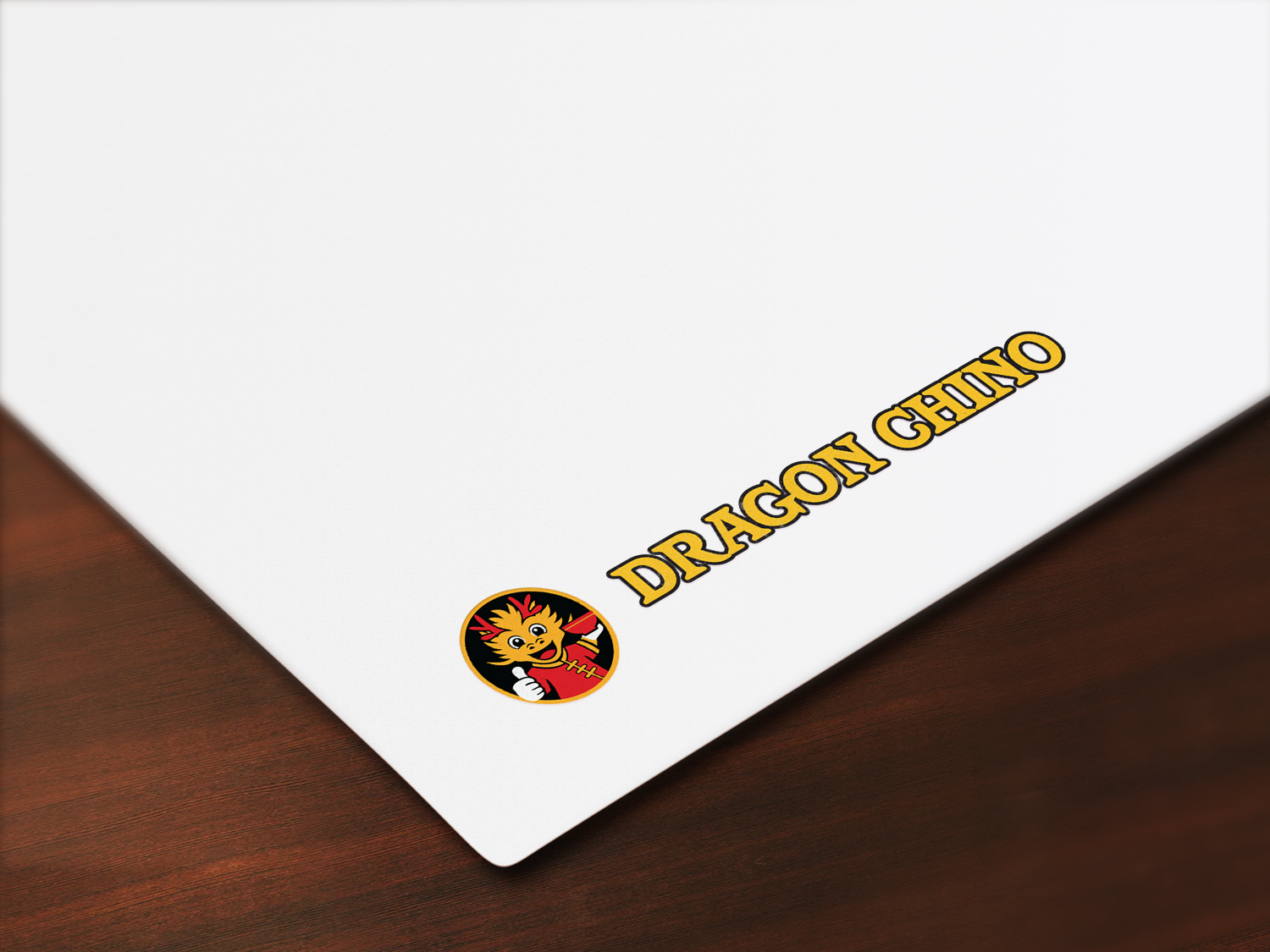
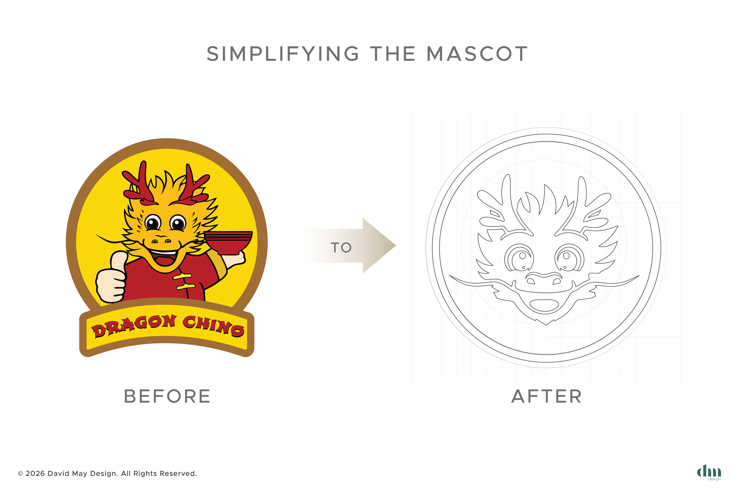
Dragon Chino | Logo Rebrand
Objective
Preserve Dragon Chino’s current identity and recognisability by keeping one or two key elements from the existing logo.
Modernise and simplify the mark to improve legibility, versatility and consistency across digital and physical uses (signage, menus, packaging, social, wayfinding).
Deliver a scalable version that works well at small sizes and in monochrome.
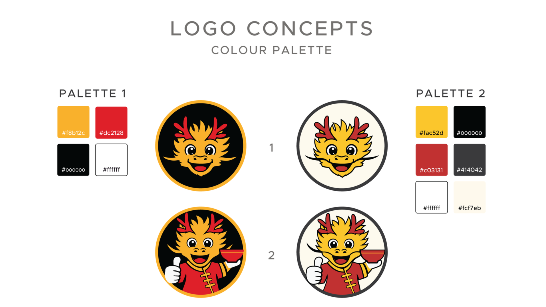
What to review in the current logo
Iconic elements: identify recognisable parts to retain (eg. dragon silhouette, a distinctive curve, signature colour or cultural motif).
Graphic complexity: find overly detailed areas or extra strokes that hinder clear reproduction at small sizes or on sign edges.
Type readability: check letterforms for spacing, weight and whether simplifying shapes would improve legibility.
Colour use: verify the palette for reliable reproduction across Pantone/CMYK/RGB and for contrast in signage and digital screens.
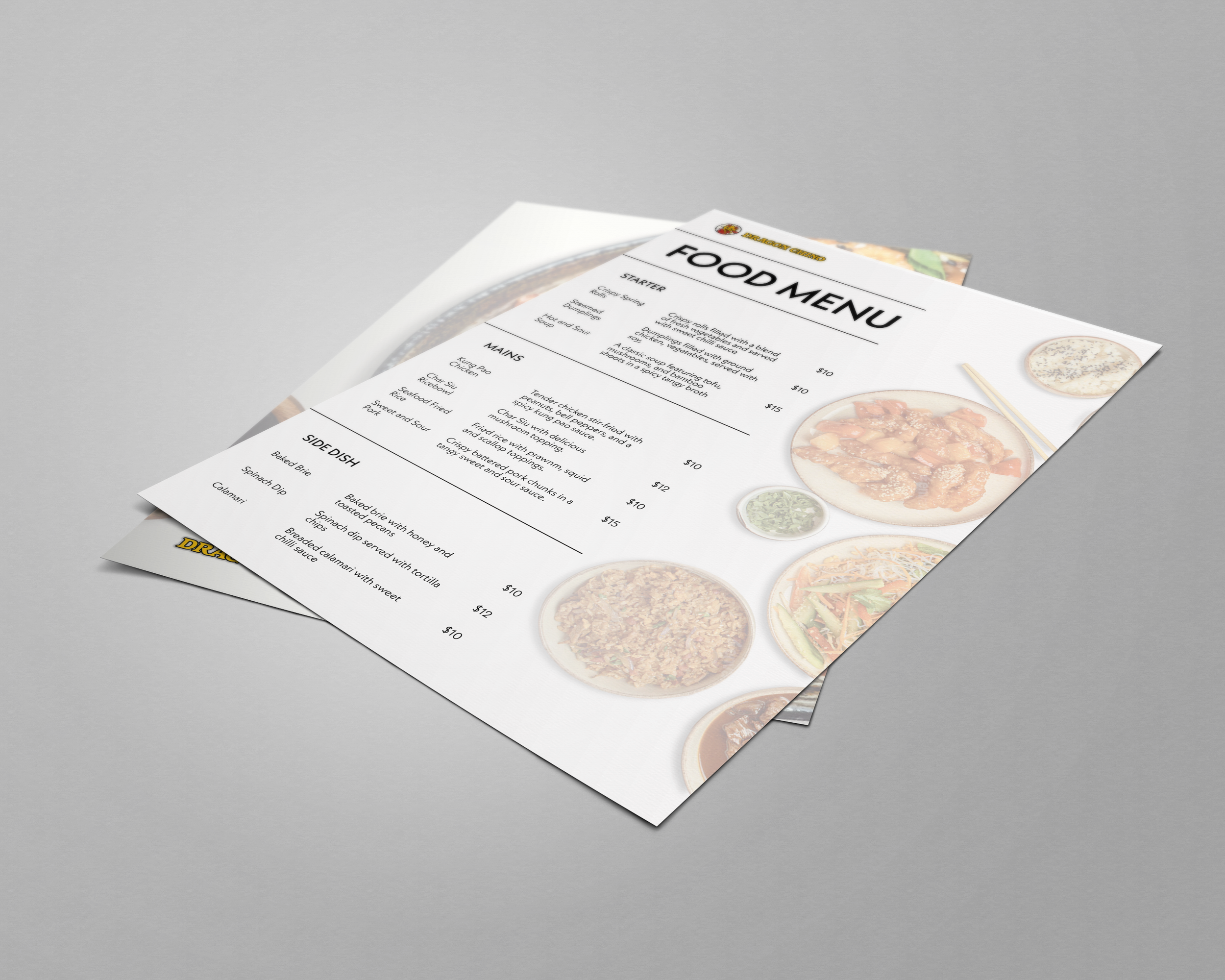
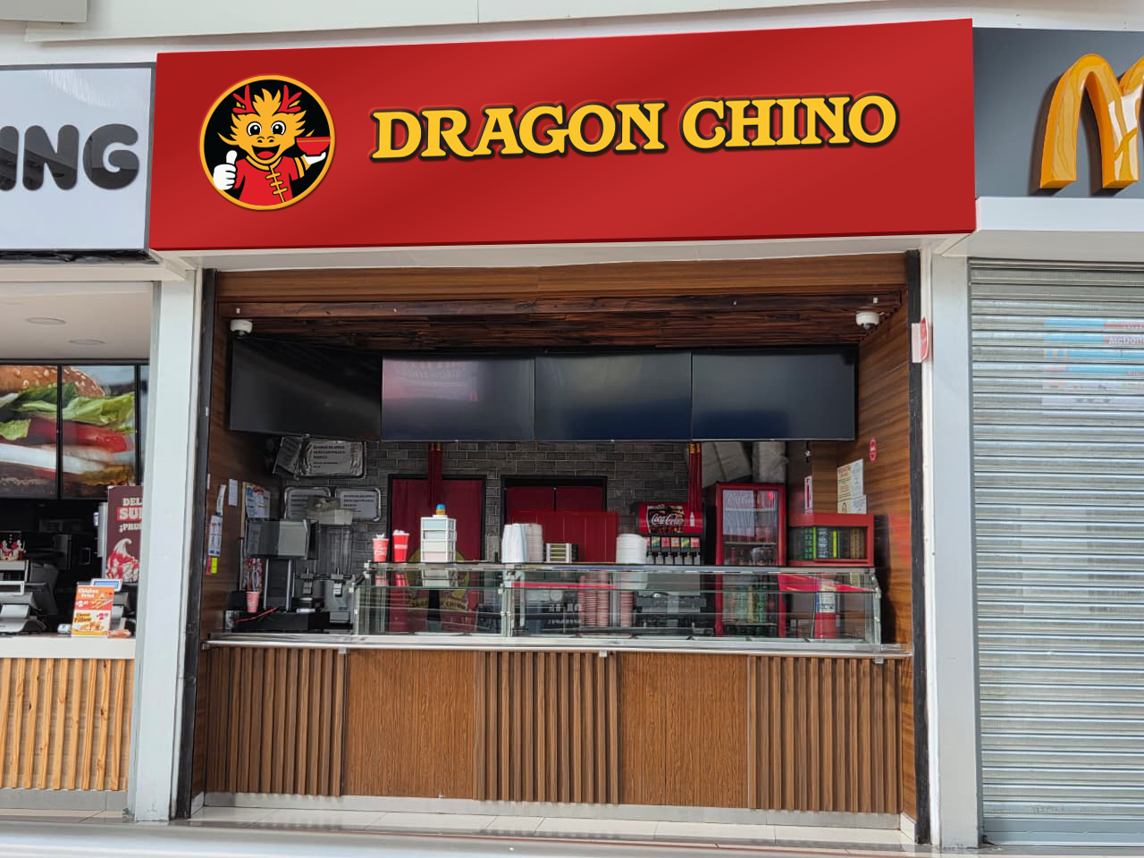
Usage contexts: list main applications (restaurant facade, illuminated signs, printed and digital menus, delivery apps, merchandising, social profiles).
Deliverables
Primary logo (full lockup).
Secondary compact lockup (for small spaces).
Monochrome/reverse variants for signage and embossing.
Clearspace and minimum-size guidelines.
Basic brand usage sheet showing correct/incorrect applications across typical contexts (facade, menu, app icon, packaging).